Today:
- Context-aware data analysis
- EDA checklist
- Practical example
- Story building, extracting data insights
Download this notebook & data:
https://github.com/harrig12/hummingbird_eda

Where does your data come from?
| Data in the wild | "Domesticated" data |
|---|---|
 |
 |
| Messy | Clean! (relatively) |
| Domain expertise needed | Well studied benchmarks |
| May require special handling (ethics approval, privacy, IP) | May be simulated, or otherwise not representative of the real world |
Data analysis should be context-aware
Depending on your context standards for how to treat your data will vary widely...
Some examples:
- A statistical theory researcher using linear regression as a toy model
- An uber intern training a model to keep an autonomous vehicle within road lines
- In my research, I look for underlying data structure which tells us something new about cancer biology
Your lion tamers: domain experts
Datasets tend to have hidden complexities that only reveal themselves once you’ve spent some time with them.
The domain expert is the person who knows about the technicalities of data collection, and is aware of the interests of your stakeholders.
(Sometimes you have to act as both the datascientist, and the domain expert!)
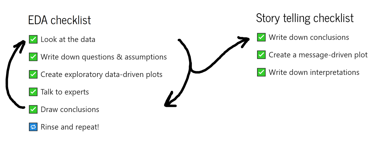
EDA is a separate activity from data storytelling

EDA is a separate activity from data storytelling

EDA is a separate activity from data storytelling
"never trust summary statistics alone; always visualize your data" - Albert Cairo

Datasaurus Dozen http://www.thefunctionalart.com/2016/08/download-datasaurus-never-trust-summary.html


# load plotting libraries
import matplotlib.pyplot as plt
import seaborn as sns

# load penguin data
from palmerpenguins import load_penguins
penguins = load_penguins()
sns.lmplot(penguins, x='bill_length_mm', y='bill_depth_mm', aspect = 2)
plt.title('Penguin bill depth is negatively correlated with length?', fontsize = 15);

sns.lmplot(penguins, x='bill_length_mm', y='bill_depth_mm', aspect = 2,
           hue='species', palette = ['#F7611A', '#C556C9', '#207474'])
plt.title('Penguin bill depth is positively correlated with length!', fontsize = 15);

Vignette: Citizen science project "Galiwatch''
- Based on Galiano Island, British Columbia
- Microclimate monitoring (temperature, air particles, weather, etc)
- Tracking hummingbirds visiting the area
Data cleaning
- Cleaned up timestamps
- Missing data
- Merged bird detection and weather data (collected at different intervals)
# Libraries we'll use
import pandas as pd
import numpy as np
import matplotlib.pyplot as plt
import seaborn as sns
# Load weather station data
weather = pd.read_csv('WS_hours.csv', na_values=['Nan', '--.-- ', '-- '])
# Format the timestamps
weather['timestamp'] = pd.to_datetime(weather.Date.astype(str).str[0:4] +
                                      '-' + weather.Date.astype(str).str[4:6] +
                                      '-' + weather.Date.astype(str).str[6:8] +
                                      ' ' + weather.Time)
# Convert to celsius
weather['Temperature C'] = (weather['Outdoor Temperature F'] - 32) * 5/9
# Load bird classifier data
bird = pd.read_csv('bird_detection.csv', index_col=0)
# Format timestamps
timestamp = bird['image'].str.split('.', expand=True)[0].str.replace('_', ' ')
bird['timestamp'] = pd.to_datetime(timestamp.str[0:13] +
                                   ':' + timestamp.str[13:15] + ":00")
# Merge datasets
weather['merge_time'] = weather.timestamp.dt.strftime('%Y-%m-%d %H')
bird['merge_time'] = bird.timestamp.dt.strftime('%Y-%m-%d %H')
data = weather.merge(bird, on = 'merge_time', how = 'left')
Back to the EDA checklist
Look at the data! 👀
data
| Timestamp | xmin | ymin | xmax | ymax | label | confidence | Temperature C | Outdoor Humidity % | Wind Speed(mph) | ... | wind gust | Wind Speed average | Daily Rainfall accumulation | Total Accumulative Rainfall | bird_spotted | Sex | Species | Date | Hour | Month | |
|---|---|---|---|---|---|---|---|---|---|---|---|---|---|---|---|---|---|---|---|---|---|
| 1267 | 2021-04-20 17:00:00 | 626.0 | 404.0 | 820.0 | 544.0 | 0.0 | 0.983709 | 17.833333 | 32 | 2 | ... | 2 | 2 | 0.00 | 0.59 | True | Male | Rufous | 2021-04-20 | 17 | 4 |
| 53167 | 2021-04-20 17:00:00 | 626.0 | 404.0 | 820.0 | 544.0 | 0.0 | 0.983709 | 17.833333 | 32 | 2 | ... | 2 | 2 | 0.00 | 0.59 | True | Male | Rufous | 2021-04-20 | 17 | 4 |
| 53166 | 2021-04-20 17:00:00 | 222.0 | 384.0 | 386.0 | 474.0 | 0.0 | 0.978049 | 17.833333 | 32 | 2 | ... | 2 | 2 | 0.00 | 0.59 | True | Male | Rufous | 2021-04-20 | 17 | 4 |
| 1266 | 2021-04-20 17:00:00 | 222.0 | 384.0 | 386.0 | 474.0 | 0.0 | 0.978049 | 17.833333 | 32 | 2 | ... | 2 | 2 | 0.00 | 0.59 | True | Male | Rufous | 2021-04-20 | 17 | 4 |
| 27223 | 2021-04-20 17:00:00 | 626.0 | 404.0 | 820.0 | 544.0 | 0.0 | 0.983709 | 17.833333 | 32 | 2 | ... | 2 | 2 | 0.00 | 0.59 | True | Male | Rufous | 2021-04-20 | 17 | 4 |
| ... | ... | ... | ... | ... | ... | ... | ... | ... | ... | ... | ... | ... | ... | ... | ... | ... | ... | ... | ... | ... | ... |
| 77527 | 2021-10-16 11:00:00 | NaN | NaN | NaN | NaN | NaN | NaN | 11.388889 | 97 | 0 | ... | 1 | 0 | 0.56 | 7.96 | False | NaN | NaN | 2021-10-16 | 11 | 10 |
| 51583 | 2021-10-16 11:00:00 | NaN | NaN | NaN | NaN | NaN | NaN | 11.388889 | 97 | 0 | ... | 1 | 0 | 0.56 | 7.96 | False | NaN | NaN | 2021-10-16 | 11 | 10 |
| 51584 | 2021-10-16 12:00:00 | 604.0 | 339.0 | 706.0 | 443.0 | 1.0 | 0.829207 | 11.611111 | 97 | 1 | ... | 1 | 0 | 0.57 | 7.97 | True | Male | Anna | 2021-10-16 | 12 | 10 |
| 77528 | 2021-10-16 12:00:00 | 604.0 | 339.0 | 706.0 | 443.0 | 1.0 | 0.829207 | 11.611111 | 97 | 1 | ... | 1 | 0 | 0.57 | 7.97 | True | Male | Anna | 2021-10-16 | 12 | 10 |
| 25628 | 2021-10-16 12:00:00 | 604.0 | 339.0 | 706.0 | 443.0 | 1.0 | 0.829207 | 11.611111 | 97 | 1 | ... | 1 | 0 | 0.57 | 7.97 | True | Male | Anna | 2021-10-16 | 12 | 10 |
73089 rows × 26 columns
What do the variables mean?
| Variable Name | Description |
|---|---|
| Timestamp | timestamp of image containing identified object |
| xmin, xmax, ymin, ymax | borders of an object bounding box |
| label | predicted object class label |
| confidence | prediction confidence |
| Temperature C | hourly average temperature (in celsius) |
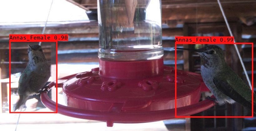
What do the labels mean?
| Label | Class |
|---|---|
| 0 | Rufous_Male |
| 1 | Annas_Male |
| 2 | Rufous_Female |
| 3 | Person |
| 4 | Annas_Female |
Assumption: data is representative
data.shape
(73089, 26)
print('Dataset spans from ' + str(data['Date'].min()) +
      ' to ' + str(data['Date'].max()))
Dataset spans from 2021-04-20 to 2021-10-16
Assumption: probably should filter out the low-confidence predictions, and the people
data = data[(data['confidence'] > 0.7) | (data['confidence'].isna())]
data = data[data['label'] != 3]
Exploratory plots
Histograms, scatterplots are good for getting a feel for your data
Quick statistical diagnostics can be very useful (R-square, p-test, QQ plot)
What was summer 2021 like?
fig, ax = plt.subplots(1,1, figsize = (8,3))
sns.lineplot(data, x='Date', y='Temperature C', ci=False);

Conclusion: Temperature peaks in early July
What is the relationship between different weather variables?
df = data[['Hour', 'Temperature C', 'Outdoor Humidity %',
              'Dew Point']].groupby(['Hour'], as_index=False).mean()
sns.pairplot(df, diag_kind="kde", corner=True, palette="viridis")
plt.close()
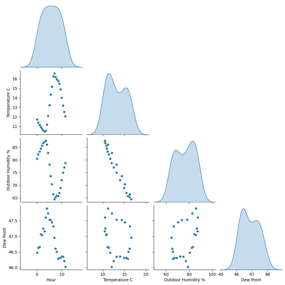
Conclusion: Peak daily temperature is around 3pm. With increased temperature, we generally see decreased humidity.
Investigate circular Dew Point
df = data[['Month', 'Hour', 'Temperature C', 'Outdoor Humidity %',
              'Dew Point']].groupby(['Month','Hour'], as_index=False).mean()
sns.pairplot(df, diag_kind="kde", corner=True, hue = 'Month',  palette="viridis", diag_kws={'hue': None})
plt.close()
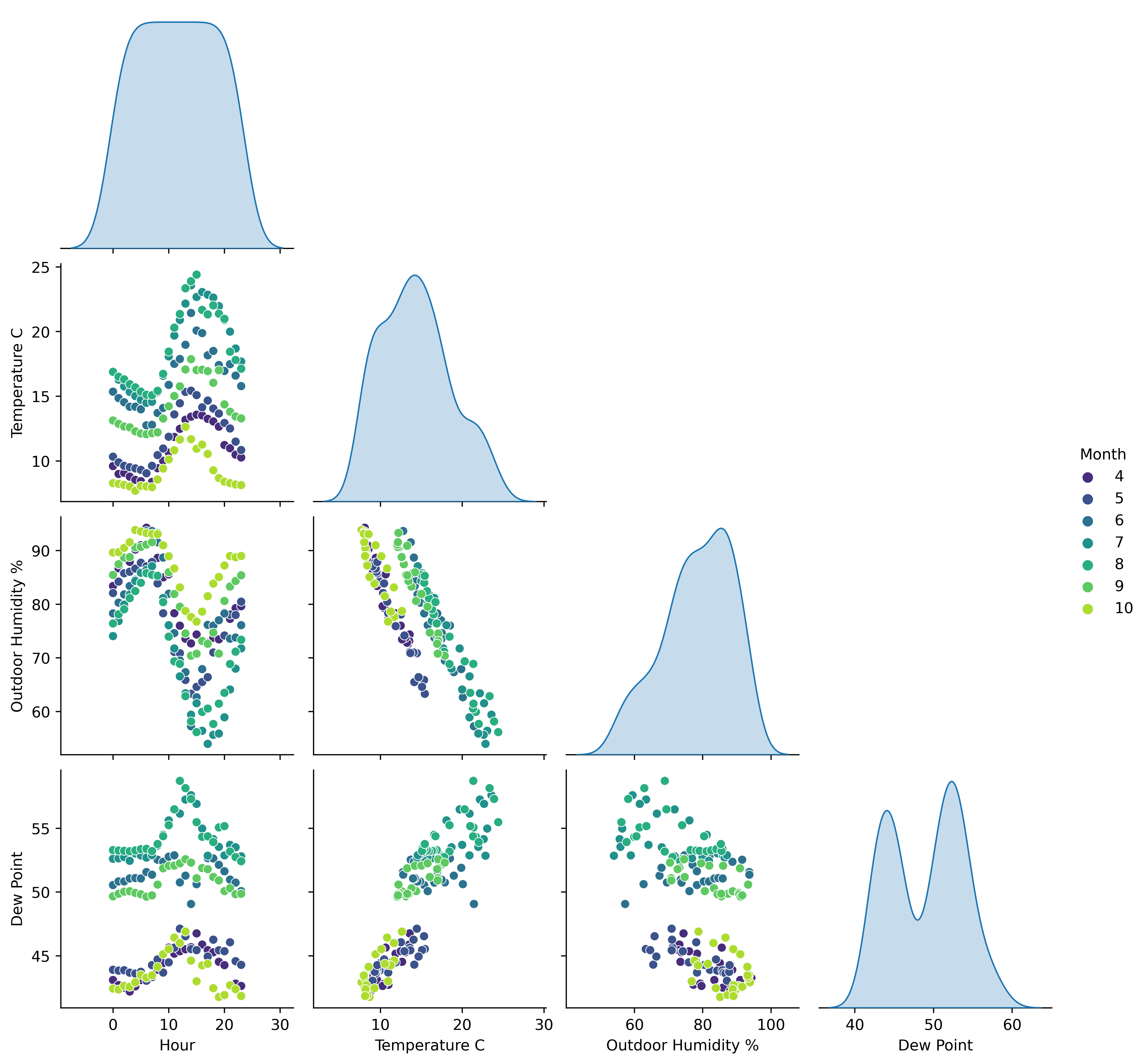
Conclusion: Relationship between Dew Point, Temperature, and Humidity chages over the season
When in the year do birds visit the feeder?
sns.histplot(data[data['bird_spotted'] == True], x = 'Timestamp');

Conclusion: Birds visit most in June - August
When in the day do birds visit the feeder?
sns.histplot(data[data['bird_spotted'] == True], x='Hour', binwidth=1);

Conclusion: Birds visit in the day between 6am and 9pm
Do birds care about the weather?
sns.histplot(data[data['bird_spotted'] == True], x ='Temperature C', hue = 'Species');

Conclusion: Anna's humming bird prefers hotter weather
Talk to an expert
I brought my exploratory plots to an expert, and went through the preliminary conclusions:
- Temperature peaks in early July
- Peak daily temperature is around 3pm. With increased temperature, we generally see decreased humidity.
- Relationship between Dew Point, Temperature, and Humidity chages over the season
- Birds visit most in June - August
- Birds visit in the day between 6am and 9pm
- Anna's humming bird prefers hotter weather
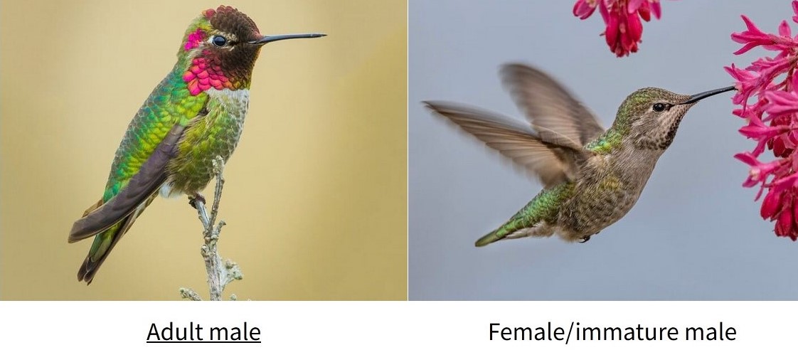
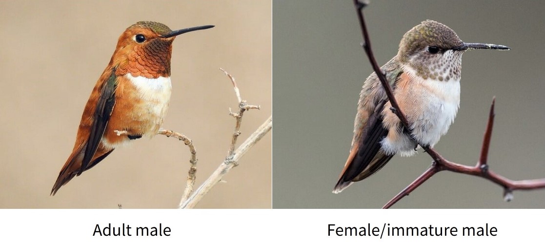
I learned that the Anna and Rufous birds have different migration patterns.
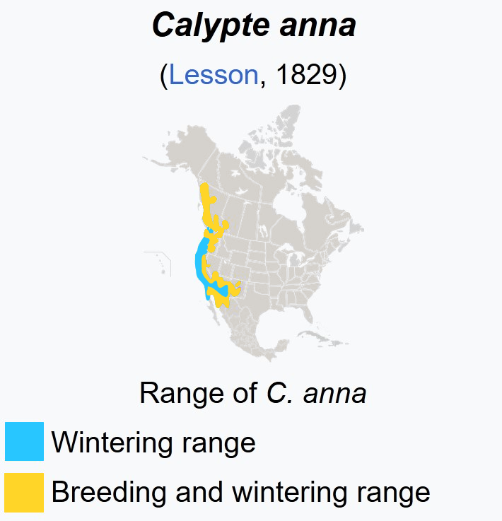
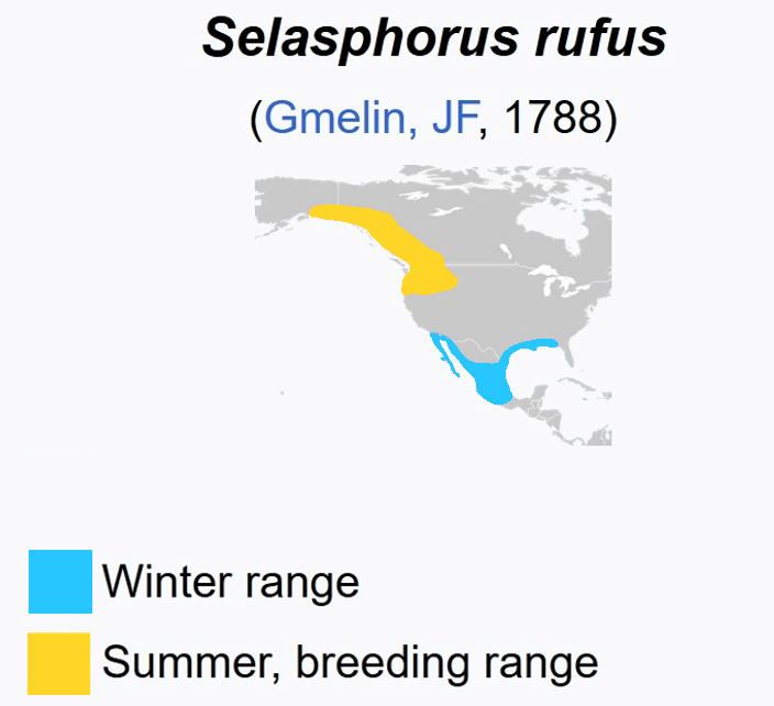
Modified from Wikipedia
Back to the drawing board
sns.histplot(data, x = 'Timestamp', hue ='Species');

Conclusion: Rufous migrate away around June, then Annas arrive
sns.histplot(data, x='Hour', binwidth=1, hue = "Sex");
plt.xlim(0,24);

Conclusion: Male & female birds visit at different times of the day
Story telling plots
Conclusions our plots should hightlight:
- Species visit at different times of the year
- Male & female birds visit at different times of the day
- Temperature and migration are confounded
# Colour pallettes
species_pal = {'Anna':'#226F54', 'Rufous':'#DA7635'}  # green & orange
anna_pal = {'Male': '#1D5D47', 'Female': '#92DDC3'}   # dark & light green
rufous_pal = {'Male': '#793E16', 'Female': '#E39764'} # dark & light orange
fig, ax = plt.subplots(1,1)
sns.histplot(data, x = 'Timestamp', hue='Species', edgecolor=None,  palette=species_pal, kde=True, kde_kws={'bw_adjust':3})
ax.set_ylabel('Number of visits captured')
plt.title('Species visits reflect migration patterns', fontsize=10);

data['Hour'] = data.Timestamp.dt.hour
fix, ax = plt.subplots(1,2)
sns.histplot(data[data['Species'] == 'Anna'], x='Hour', hue = 'Sex', multiple="fill", stat="proportion", palette=anna_pal, binwidth=1, ax=ax[0])
sns.histplot(data[data['Species'] == 'Rufous'], x='Hour', hue = 'Sex', multiple="fill", stat="proportion", palette=rufous_pal, binwidth=1, ax=ax[1])
ax[0].set_title('Anna')
ax[1].set_title('Rufous')
ax[1].get_yaxis().set_visible(False)
sns.move_legend(ax[0], "center left", bbox_to_anchor=(2.3, 0.3))
sns.move_legend(ax[1], "center left", bbox_to_anchor=(1.1, 0.6))
plt.suptitle('Annas, but not Rufous have a sex-dependent daily behaviour pattern');

sns.boxplot(data, y='Temperature C', x = 'Species', palette=species_pal)
plt.title('Annas may prefer higher temperatures than Rufous');

from scipy.stats import ttest_ind
group1 = data['Temperature C'][(data['Species'] =='Anna')].dropna()
group2 = data['Temperature C'][(data['Species'] =='Rufous')].dropna()

ttest_ind(group1, group2)
Ttest_indResult(statistic=90.0467639582544, pvalue=0.0)
fig, ax = plt.subplots(1,1)
sns.histplot(data, x = 'Timestamp', hue ='Species', palette=species_pal)
ax.set_ylabel('Number of visits captured')
ax2 = ax.twinx()
sns.lineplot(data, x='Date', y='Temperature C', ax = ax2, ci=False, color ='#932F6D');
plt.title("Temperature and migration are confounded");

These plots are far from perfect from a design perspective, but the point is to show the distinction between the EDA iteration and story telling.

